Worldwide Internet users are now at 3.2 billion from 2.9 billion in the previous year, according to Internet Live Stats. Entrepreneurs are acknowledging this boom, seeing the Internet’s importance in promoting their businesses globally.
According to Fleishman-Hillard’s recent report, 89% of consumers are turning to Google and other search engines to find information on products, services, or businesses prior to making purchase decisions. To take advantage of this growing user-base, create a compelling website design.
In Social Trigger’s study, “Trust and Mistrust of Online Health Sites”, research participants rejected or mistrusted websites mainly because of how they were designed. That’s why addressing web design concerns– boring layouts, complex graphics, and lousy typefaces – maximizes your online impact. There are different web design techniques, but what works best for our ever-shortening attention spans is a single page design, also known as parallax scrolling.
Parallax in a Nutshell
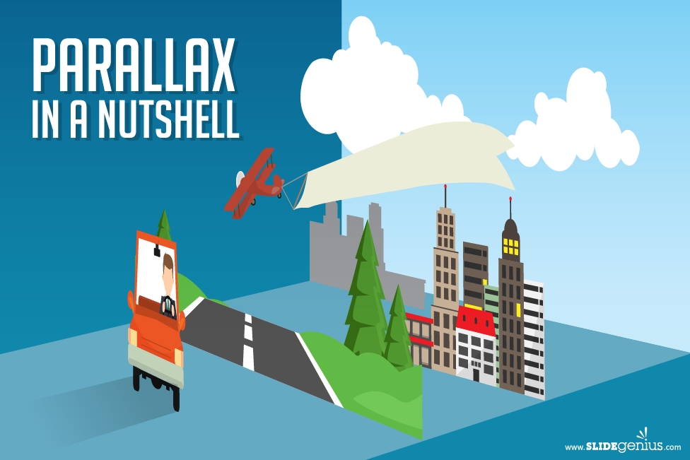
This concept is a new web design trend, but not for the animation world. It was first developed in the 1930s as a special animation effect. It was also used in programming in the 1980s, creating an illusion of depth in 2D video games.
Unlike other kinds of web design, this type displays multiple layers of background and foreground images that are animated at different speeds and perspectives. It smooths transitions from one section to another by scrolling past the succession of images.
This technique made its way to the web in 2011. Nike pioneered it when they launched their page “Better World.” Amazed by its creativity and boldness, other site owners jumped onto the animation bandwagon.
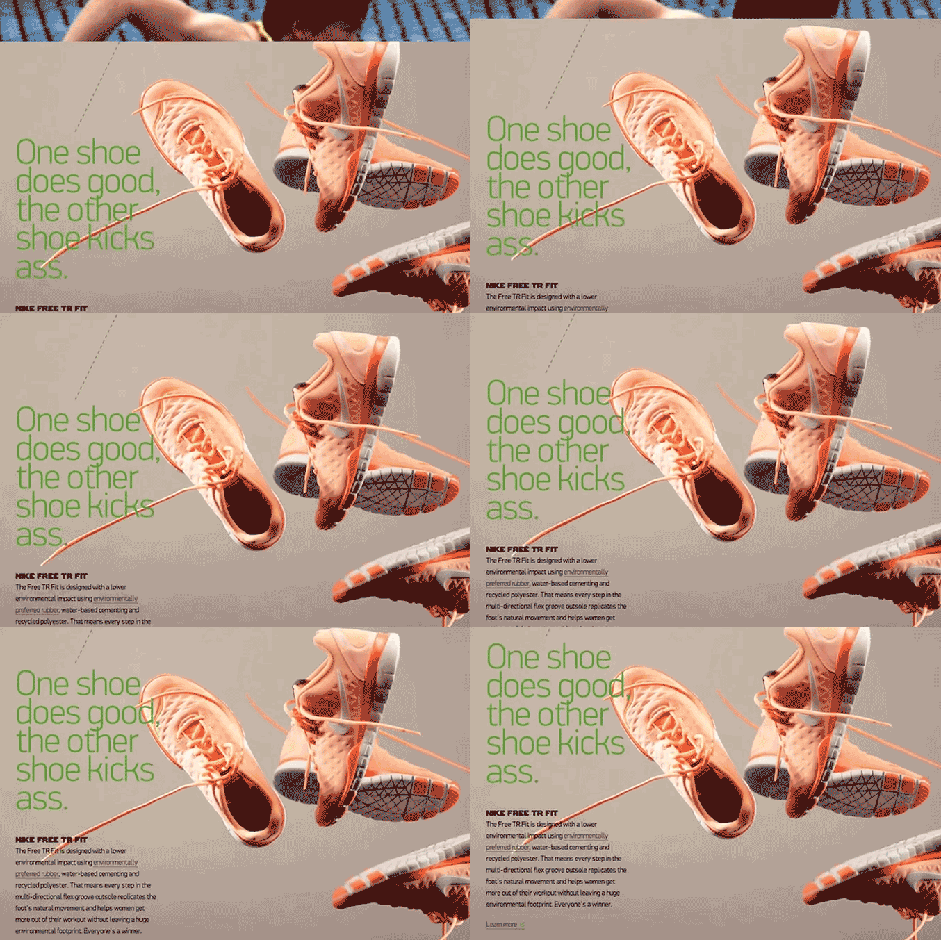
It has gained popularity across the Internet, making headway in an environment dominated by traditionally-designed websites. Unlike conventional site designs, the parallax effect prioritizes easy navigation. It incorporates all the necessary design elements in one page and presents information at a glance. Single-page sites concentrate on providing more content and less clutter, offering customers a more efficient and engaging browsing experience.
Scrolling Websites Done Right
Still don’t know what a parallax website looks like? Here are some websites that make great use of the scrolling effect:
1. Dangers of Fracking
When narratives come into play, there’s no tool better than parallax web design. It curates content in a way that summarizes business goals and elicits emotions, resulting in deeper relationships between the audience and the brand.
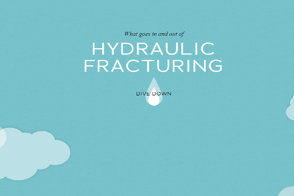
In the case of Dangers of Fracking’s site, scrolling helped communicate the subject of hydraulic fracturing through visual narration. Its clever use of animation and background imagery took the storytelling approach to an all-new level.
As an added touch, it used the trigger words “dive down”, encouraging users to keep on scrolling until they reach the end of a water droplet’s journey.
2. Flat vs. Realism
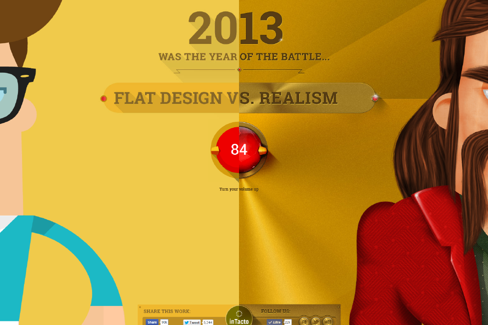
It’s important to provide quality content for your site, but most prospects base their first impressions on your page design. According to a study from Stanford University, 75% of users judge a brand to be trustworthy and credible, depending on how good the website looks.
A well-designed site, like inTacto’s Flat vs. Realism, sets a good example of maintaining the brand’s image. It reflected the company’s strong reputation for promoting quality design in the digital world.
Engineered in a parallax format, this site fulfilled its goal of discussing the battle between flat design and the old empire of realism. Its creative use of the scrolling effect has generated a lot of buzz, which quickly captured the attention of most viewers.
In fact, this site was hailed as Website of the Day on July 2, 2014.
3. Scroll for Your Health
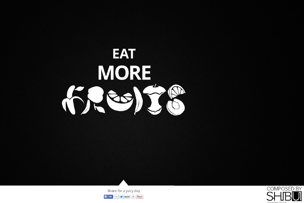
Curiosity fuels a user’s desire to explore the entire site. When a site grabs a viewer’s attention, longer page visits are also guaranteed.
This is what sets parallax apart from traditional navigation. It keeps visitors scrolling to see what’s coming up next, which then directs them towards a desired action.
Shibui embraced this web design on their site, “Scroll for Your Health”. Bursting with bold graphics and fluid animation, viewers are exposed to the surprising health benefits of different fruits. It also gives users tons of health information, encouraging them to make every day a juicy feast. This site was nominated for Awwwards, and won website of the day at CSS Winner on April 26, 2013.
Relax with Parallax

With today’s ever-evolving web trends, making your site stand out can be daunting. Jump in with this fluid design movement for your business. Take full advantage of its nuanced visual approach, drawing user attention and conveying messages in a unique interactive manner.
Stay calm and relaxed with the kind of engagement this effect offers your site visitors. Try it out and see the business benefits of its scrolling effect—page rankings, bounce and conversion rates, and brand credibility. With parallax, you can take your viewers on an educational and entertaining scroll through the park.
References
“8 Reasons Why Pageless Design is the Future of the Web.” Digital Telepathy. June 5, 2013. Accessed August 17, 2015.
“50 Great Parallax Scrolling Websites.” Creative Bloq. July 7, 2015. Accessed August 17, 2015.
“Parallax Scrolling Background.” Mobirise. n.d. Accessed August 24, 2015.
“Parallax Scrolling In Web Design.” Dextrys. n.d. Accessed August 17, 2015.
“The Benefits Of Parallax Scrolling – Enhancing Visitor Engagement.” Unidad 22. n.d. Accessed August 24, 2015.
You might also like…
Rick Enrico is the CEO and Founder of SlideGenius, Inc., a global presentation design agency. He regularly publishes expert presentation tips on the SlideGenius blog. He currently oversees an experienced team of designers, software developers, and marketing professionals that specialize in creating custom corporate presentations and cloud publishing applications.

