Infographics are all the rage these days. They are a powerful form of content marketing that can attract a lot of eyeballs – if done right!
What comprises an infographic done right? In the mind of this writer, interesting topic, solid research, and aesthetically pleasing design are just a few things that come to mind. However, even with all these things in place, as well as many other factors that contribute to a great infographic, if the infographic is not marketed effectively, then what is the point?
In this post, we will look at 7 common mistakes that marketers make when publishing infographics on their sites or blogs.
1. Infographic Not Properly Displayed
Infographics are typically large graphic files that can be anywhere from 500 – 1,000+ in width and even longer in length. When publishing an infographic, a webmaster will obviously want to make sure the infographic is displayed in its largest version possible but often they have to be scaled down in size in order to fit within the content area of a site’s theme. Scaling the image down can oftentimes make the textual portions of the infographic “unreadable.”
This is why it is vitally important to offer those viewing your infographic the ability to see the full size version. This can be done by simply linking the scaled-down version to the full size version or providing a link that clearly indicates that when clicked upon, the viewer can see the full size version. It’s sad how many times I’ve come across what looked like a great infographic but was unable to read it because the publisher offered no “full size” version. This will not encourage viewers to socially share or even link to your labor of love.
2. Absence of Social Sharing Buttons
When you go through all the work of creating a great infographic and finally publish it, you no doubt want people to view it and hopefully share it socially. To have the best opportunity for success with social sharing, you need to make it easy for your viewers. This is where social media sharing buttons come into play. Now it would be impossible and even annoying to display buttons for every social media network in existence. It is however not only possible but acceptable to include social sharing buttons for the top social networks – these being Facebook, Google +, Twitter, LinkedIn, Pinterest, StumbleUpon and possibly Reddit and Tumblr.
If your site runs on WordPress (seems most do these days), then an excellent plugin that will allow you to display social media sharing buttons is Digg Digg. There are options for buttons to appear above or below the content of a post and even a floating sharebar. Whether running WordPress or not, the basic idea here is to make it as easy as possible for people to socially share your content. Social sharing buttons within the post help to accomplish this.

Digg Digg Floating Sharebar
3. Failing To Publish To Popular Social Media Networks
Unless you have an audience like Mashable, Funny or Die or other popular web site, you are going to need to put forth some effort to get people to see your published infographic. One way to go about this is to make sure you are publishing to your company social networks. Any company worth their salt, should have already established social media presences on the top networks, including Facebook, Google+, Twitter and Pinterest. Additional networks can include LinkedIn, Tumblr, StumbleUpon and even Instagram.
While having these social media presences in place can be great for branding, customer service, announcements and the like, they are also an awesome venue to “push” your content. In fact, every time we publish an infographic on our infographic archive site, we post a summary and link on our social media sites as well. Studies have shown that to get the best effect of sharing your content on your social media networks, do so within two hours or less or publishing the original content.
4. Improper Syndication To Social Media Networks
Now that we have discussed the need to share your content to your social networks, I must point out that there is a right way to do this as well as a wrong way. Posting formats vary among the major social networks but here are a few things to keep in mind when posting to any social network:
- Always link back to your original content! One of the main ideas with sharing is to drive traffic to the site. This is hard to do when one does not link back to original content.
- Where applicable, include a short description.
- Where applicable and when appropriate, utilize hash tags (not all social networks utilize hash tags). Just be careful not to abuse them!
- Include imagery in your social media posts and test against post without images to see which brings better results.
- Call out influencers when applicable (i.e. @username, username+, tagging individuals/companies in Facebook, etc.).
While the above tips can be applied to just about social network, here are some tips specific to certain networks.
- Test out repeat tweets at various times of the day (i.e. morning verses evening) as well as tweets with and without attached images.
- If your infographic includes info on company or individual, include @ reference to that company/individual in your tweet.
- For older infographics, retweet related to current trends. For example, a Halloween infographic published last year might have new life if retweeted this year.
- Link back to your original infographic post. Otherwise, Pinterest will simply link to the larger version of your image and traffic will not be driven to your site.
- Post infographics to topically relevant boards when possible.
- Include a short title and/or description of the infographic.
- In order to encourage visitors to your site, consider pinning a cropped version of the infographic, forcing viewers to visit your site to see full size version.
Tumblr
- Link back to your original infographic post. Tumblr still allows “followed links so take advantage not only of opportunity to drive traffic but earn link popularity.
- Include a custom file name at end of URL, taking advantage to use keywords relative to topic of your infographic.
- Include a short title and/or description of the infographic.
- Add 2-3 tags in the tag field.
5. No “Embed This” Code
One of the reasons publishers like to create and post infographics is the opportunity they create to earn natural inbound links from other sites. The problem is that individuals may re-post your infographic without linking back and/or giving proper credit. To help have more control over this, include an “Embed This” code in the post so that viewers can cut and paste HTML code to display and link back to your infographic. This will give you more control over where people link to as well as the alt and title attributes that will appear when the image is displayed on the linking site.

If you are running a WordPress site, we have made it super easy for you to include an Embed This code. Simply download our Embed Code Generator from WordPress.org, install, activate and you’ll have the ability to add embed codes to posts, pages and even custom page types.
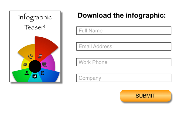
6. Hidden Behind Registration Walls
Every so often I come across an infographic that requires me to “register” to view it. They may provide a sneak-peak but in order to view the infographic in its entirety, you have to include your contact information such as name, email address and even phone number.
This is done of course to gather contact data most likely for marketing purposes. The problem with this is that studies show that upwards to 86% of people will leave a web site when asked to enter contact data or create an account. You have to have a much better reason to ask for someone’s contact details than simply showing them an infographic in my opinion.

Image Credit: http://www.coolinfographics.com
7. Submitting to Infographic Archives
When we launched Infographic Journal in September of 2011, there were only a handful of infographic archives. Now there are dozens and dozens more! It would be a cumbersome task to try to include your infographic in each and every infographic archive that exists. Your time is best spent picking and choosing the best of the best – those infographic archives that have been around for awhile, which are very active and most important, those which draw a lot of traffic.
Two of the biggest mistakes I see people make when submitting to infographic archives are as follows:
A. They do not create a unique description but rather pull text from their own site. This is just pure laziness! With duplicate content issues being one of the elements that will thwart an organic search marketing (SEO) effort, why would you want to create a nightmare scenario and have duplicate content from your site spread all over infographic archives?
B. Descriptions are not varied for each infographic archive. Again, this is a duplicate content issue. If you want to get the most out of each place your infographic resides, vary the descriptions you submit for consideration.
There are more mistakes that are made when submitting infographics to archives but these two are the most important to avoid in my opinion.


