As chief editor at Infographic Journal, I have the privilege of seeing some of the best infographics that are being designed these days. I also have the misfortune of seeing a lot of really bad infographics! Poor design is at the top of list when I judge an infographic to be a bad one but there are plenty of other issues (mistakes) that contribute to a poor quality infographic.
Before we get into some of these, I must say that infographics done right can be a fantastic way to drive traffic, earn natural inbound links, generate an abundance of social sharing and ultimately build your brand. The caveat however is that they need to be done well – good topic, good data, good design and ultimately, good promotion. And unless you are a graphic artist by trade, good infographics are not cheap. The ones that are cheap in cost are usually the ones that would make my “bad list.”
The moral of this story before it is finished is that if you can’t produce quality infographics, then best not to do them at all! Here are some of the most common infographic design mistakes.
1. Poor Design (Ugly Infographic)
Let’s face facts: quality infographic design is not cheap. Notice I said “quality.” Sure you can get an infographic designed for little cost and there are even online tools that allow you to design your own. Unfortunately taking the cheap route usually results in an infographic that is plagued by poor design. Things that can contribute to poor deign include the way the infographic is laid out, its color scheme, use of stock imagery, crazy-looking fonts, graphics that are poorly designed and the list goes on.
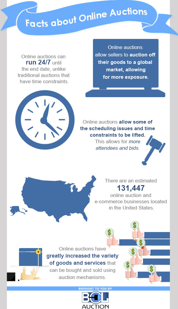
The old adage “a picture is worth a thousand words” rings true so rather than continuing my rant on poor design, let me show you one.

We removed branding so as to not embarrass creator. 😉
2. Too Small To Be Seen
One thing I come across every now and then is what looks like a great infographic but the version that is published online is too small to be readable. Either the text is too small to read or the entire infographic is displayed in small version with no option to view it in its full size. There are times that infographics are scaled down in size so that they can fit within a blog or web site’s theme restraints but there should always be an option to view a full size version. This can be done by either linking the scaled down version to the full version or simply providing a textual link to the full version.
What is the right size for an infographic? There is no solid rule but I typically like to see them range from 750 to 1,000 pixels in width. And of course, no matter what size they are, if you need a magnifying glass to read the textual portions of an infographic, then it is too small.
3. Grammar Errors
Misspellings and other grammar errors are much more difficult to fix once an infographic is completed. Whether designing yourself or having a graphic designer do it for you, make sure to read the textual content of the infographic again and again and again. In fact, have a few eyeballs look at it. It’s no fun getting schooled from a grammar Nazi once your infographic is published. It also can take away from the professional appeal of your brand.
4. Incorrect Data
Just because you can “google” it doesn’t means it’s true! Make sure your data is from reliable resources and that it is in fact true and accurate. Just as grammar errors are hard to correct on a finished infographic, having to fix errors in data can also be a less-than-fun experience.
Another thing I’d like to point out here is to make sure your data is current. If your infographic is using statistics from 2010 and it’s 2014, then your data is dated and most likely not correct. I’m not referring to historical facts as history is history but rather things like statistics, polls and the like. It’s best to get the most current data so that your infographic is current.
5. No Citations / Sources
This may not apply to all infographics but for those that include elements such as historical facts, current trends, definitions, and the like, don’t forget to include citations or sources to back up your information. This provides credibility to your infographic and helps those viewing it to know that the information is reliable and can be trusted. Citations and sources can be included at the very bottom of the infographic so as to not interfere with the overall message of the infographic itself.
6. Not an Infographic at All
Infographics are supposed to be “visual representations of data” or a means of “telling a story visually. ” Because we accept free submissions of infographics at Infographic Journal, I review many “infographics” that are nothing more than wordy articles turned into an image, or the equivalent of a post card or brochure.
Below is one such example.
This is more like a brochure than an infographic, and a poorly designed brochure at that! A quality infographic needs to be much more expansive and informative than this example.


